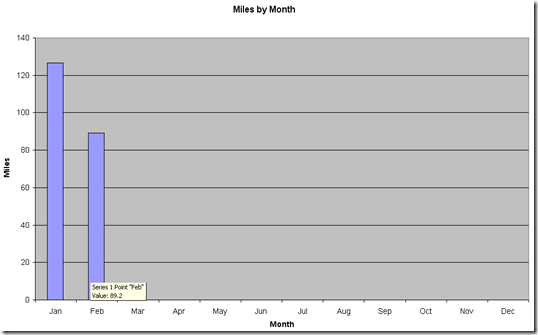
February came and February went, and suddenly March is upon us. Suddenly under 3 weeks remain until we set out on our Walk. Suddenly time is running out to put in any more training. February did see us take a few strolls though, and below is a representation of how the month looked from a statistical point of view.
The miles weren’t as high as in January (and I don’t think I can blame that entirely on February being a short month):

Compared with the miles of previous years the graph’s looking the way I wanted it:
Compared with ascent in February in previous years we can clearly see that the bar has always been set low:


Quite splendid Statistics, Ma'am! We can rely on you.
ReplyDeleteCan you sort mine out too? (Trouble is I didn't record height climbed... Doh!)
But I do know how far each pair of boots have been...
You may notice that my ascent statistics are also somewhat lacking prior to 2008..
ReplyDeleteAnd now that I look it seems that I completely failed to record any footwear statistics for 2007.
I can tell you what the weather has been like for every walk for the last 5 years, though...
Problem is that the more information I record, the more complicated these spreadsheets and graphs get!
As an excel and numbers nerd, may I suggest two further performance indicators - Miles per day (takes care of the length of the month) and ascent per mile. These can be easily produced with collecting any more data.
ReplyDeleteYou could do a four-week rolling cumulative miles and ascent as well. If you had the time...
helumo - an african president.