I said that I was putting the Monster Spread Sheet away and not looking at it again until at least the middle of next week, and I have been (almost) true to my word. Fortunately I wasn’t swayed by Alan Sloman’s (somewhat mischievous) request for 3D graphs, because they’re outside of my knowledge of Excel.
Mick, however, was happy to play with the numbers some more, and he’s been disproportionately enthusiastic about the results of his labours.
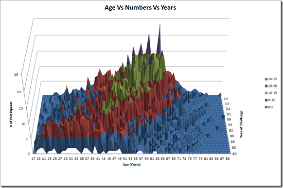
Just two charts have resulted. This first one shows a 3D plot of ages against each year, against the number of people of that age. Across the front of the graph are the ages from 17 to 90. From front to back are the years with the first challenge of 1980 at the front and the most recent challenge of 2012 at the back. The vertical axis is the number of Challengers in each age group for each year. The colour coding helps to see how many people are in each age group. Simple, eh?
What you see is that there are lines being formed going from front left towards the back right, showing that the population is getting older as the event goes on. You also see that there is becoming a bigger concentration of participants in the ‘popular’ ages (so people new to the event tend to be in that age group of mid-40s to about-60), and those ‘popular’ ages are also moving further right, year on year. Mick’s suggests that the right-wards march of the peaks indicates there is a core of Challengers who return each year and who are, of course, getting older each year. The plot also shows the event is no longer attracting the younger element (under 35s).
Here’s another view of the same thing:
As you’ve probably gathered (the title’s a bit of a give away), this is simply looking down on the same plot from above. It would have been better if it had used more colours, but Excel was somewhat unmoving on the colour options on this version. What is clearly shown, even in the limited colours, is the marching rightwards of the ‘popular’ age group, with a widening of the ‘popular’ group too.
Now surely that’s befuddled/impressed everyone enough to mean that there will be no more requests, at least until the end of next week?
-----------------------------------------------------------------------------------------
Click to go to previous parts of this series of posts:


Thanks Mick, that's excellent!
ReplyDeleteI know this is a big ask, but it would be a bit clearer to see trends if we could see the numbers expressed not as absolute numbers but as percentages of Challengers, as this would smooth out the growth in entries over the years.
And (while I'm asking) I know it's not the correct way to show it, but could each year be show as a smoothed curve? You could plot ages in groups of three years, say, to smooth each curve out.
From the first 3-D graph it appears that there is a new bulge forming on the most recent years of slightly younger Challengers in the 37 - 47 age range, appearing about '06 or '07.
I think the smoothed curves might show this to better effect.
I'm saying this as I believe in these recent years the Challenge seems to have attracted a tranch of these younger participants. My theory is that they have arrived from the better publicity of the event from the internet blogs which only arrived around '95. The magazine's age group has traditionally grown quite old, until Emily got her hands on it recently to refresh its image.
So - I was wondering - could you look at that? You are a sweetie. Thanks hugely - this really is brilliant stuff!
That 06/07 blip is me and my mate Alan. We started in 06 at the young tender age of 41. Wow I am a stat. Nice.
DeleteI do believe that Mick has already done some work on the percentage version, Alan. He was also certainly talking last week about three-year-averages (admittedly he was talking about what I should do next, but I think that Mick would be far better suited to that one).
DeleteI don't think that any of that will get finished for a couple of weeks now though. Aside from the general pesky working malarkey, Mick's got a trip to Israel to make.
Cheers, Miss!
Delete:-)
Just don't let him forget... He's a bloke and blokes are great prevaricators. (Well, I am, anyway...)
The first graph is 'Pinnacle Ridge' and the second graph is a quilt.
ReplyDeleteI wondered about the 'Great Glen' in the middle of the second graph until I realised it's the F&M year.
I don't have any request, I just wish I had the time to fiddle with Excel myself.
Ok - enough - now I'm going to lie down in a darkened room......
ReplyDeleteLaura, make room for me! I feel a little dizzy...
ReplyDeleteI’m a bit worried about that “...march to the right...”
ReplyDeleteWill entries depend on membership of the National Front, and non-finishers rounded up and put against the wall?
Eeek! Poor choice of words by moi, perhaps?
Delete