It’s becoming a bit of a tradition that I round up each year with some illustrated walking statistics (and, incredibly, some people are waiting with baited breath for this!), so here we go with a review of 2014.
The headlines are:
Total distance walked: 2203 miles*
Number of walks taken: 242 (109 of which were entirely without Mick; 12 more were partially without Mick)
Number of days on which I went out for a walk: 227 (some Marilyn-bagging days have included two distinct walks in a day)
Total ascent: 231,000’
Average ascent per mile: 105’
Number of summits visited: 66 (38 of which were after the middle of October)
Number of nights spent in a backpacking tent: 32
Number of nights spent in Colin the Campervan: 99
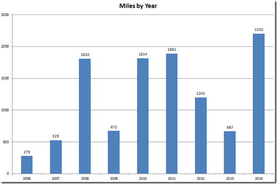
The total of 2203 miles (just over twice my original target for the year) makes it my highest mileage year on record and you can see in this pretty graph how 2014 stacked up against previous years:
This is how the miles mounted up on a month-by-month basis:
What stands out is that I (apparently) did precisely nothing in August. The reality was that I spent almost every waking hour of every day renovating a house which involved a huge amount of activity – but with no time for walking. That renovation also took up two weeks of September (which is less obvious due to the mileage I did in 12 days on the Welsh coast making up for the first half of the month), and part of October. The slight drop off in June and July was caused by the resting of a sore foot (I found on my first walk in July that it was no better at all so I may as well have just carried on walking on it!).
Sticking on the subject of ‘activity by month’, I’ve looked at a couple of new statistics for this year, starting with the number of days I walked in each month:
And to save anyone from having to do any sums (because I’m sure it’s the first thing that popped into your minds…) here’s a graph showing the average number of miles I walked per walking-day in each month:
That gave an overall average of 8.9 miles per walking day, but if I take the year as a whole (including those days where I didn’t go out at all) then the average across the year drops to a tiny smidge over 6 miles per day.
Turning my attention away from miles walked to look at ascent, this is how the lumpiness was spread throughout the year:
To be more meaningful, this needs to be looked at in conjunction with the ‘miles per month’ figures to give an average ascent per mile for each month, which results in a different shape of graph:
January’s walks were mainly local circuits started from my own front door, hence the lack of ascent. July was in the Dolomites and Bavarian Alps, hence the high average. September’s figure shows that the Welsh coast features quite some undulations, and late October, November and December saw the start of my Marilyn campaign.
In terms of the quality of the miles walked, of this year’s 242 walks only 78 were in my local area. Whilst I haven’t got comparative figures for previous years, I think that the percentage of repetition was remarkably lower this year (particularly as I discovered some new local paths) resulting in a higher quality of miles.
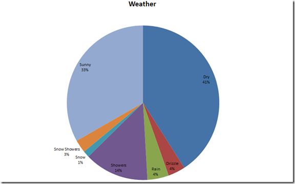
2014 will stand out in my memory as being a good weather year (although it did rain quite a bit when we were in Europe, whilst the UK basked in a heat wave), and this graph bears that out:
I’m struggling to believe that anyone will have dragged themselves this far down this post, so I’ll save myself the trouble of copying across my ‘shoes worn’ pie chart, but as cakes and baking have fuelled my miles so admirably, I’ll finish with this one:
(*On top of the 2203 miles walked, my Fitbit tells me that I covered another 550 or so miles just in general everyday life, but those miles don’t count.)


Impressive!
ReplyDelete:-)
JJ
....and is there a bargraph for the last pie-chart?
DeleteMad...quite Mad!! :-))
ReplyDeleteI think that Fitbit thing is going to meet itself coming back.
ReplyDeleteI've been waiting. And you don't disappoint. Excellent!
ReplyDeleteI would just point out that you "world's most accurate pie chart" actually shows something that looks like an egg custard tart, not a pie.
ReplyDeleteAnd you were right - "And to save anyone from having to do any sums (because I’m sure it’s the first thing that popped into your minds…) here’s a graph showing the average number of miles I walked per walking-day in each month:" It was the first thing that sprang to my mind!
:-)
All quite wonderful!
x
I agree with Alan. I'm 'well out of breath'!
ReplyDeleteI quite enjoyed reading this... I could get into this stats business.. I keep them for quite a few things, but oddly, nothing this detailed for walking! It's quite interesting when broken down into categories!
ReplyDeletewhat we really want to know about are the extremes - the paths of glory (not the lowest, but the peaks !) - I'm sure Oscar would have a better phrase but that's all I can manage through the sniffles . . . .
ReplyDeleteExcellent stats, now I must get along and do mine :-) Not much walking this year but a couple of half decent bike rides :-)
ReplyDelete