Do you recall how, back in November, upon receiving the news that we had places on the 2013 TGO Challenge, Mick celebrated by concocting a number of graphs based upon the three pieces of information available about each of the participants on the list for next year’s Challenge?
Following on from that, he received the available data for all 33 Challenges to date and in between walks during our long weekend in Llangollen we spent 24 man-hours putting the data into a more useable format.
Well, talk about a dog with a bone! Mick abandoned his household duties and for the next few weeks he took on the full-time project of obsessively doing even more data sorting and cleansing (involving some impressive formula) so that he could come up with those all-important statistic illustrations which have been missing from all of our lives for all of these years.
So, if you’re ready (sitting comfortably, feet up, glass or mug of something in hand), here is a sample of what he’s come up with:
1) We’ll start off with the number of participants who have started the Challenge each year. The years which stand out are 2001 when Foot and Mouth prevented a full Challenge from taking place, and 2004 and 2009 when the number of places were increased in celebration of the 25th and 30th anniversaries of the event.
2) This one shows the gender split for each year. It’s not particularly clear in this (correct) format…
… so he also put it into a format which, whilst not really appropriate for the data (see, David, I paid attention to your previous comments!), does make it visually clearer:
You’ll notice that there are a number of people of unknown gender. They mainly featured in the early years of the event and presumably they did know their gender, but as their name is shown with only their initial and no honorific, it isn’t obvious from the data. This data may not be entirely accurate either, as some names could have been male or female and an [educated] guess has been made.
Anyways, what is clear is that female participation is still the minority, but that it has increased over the years.
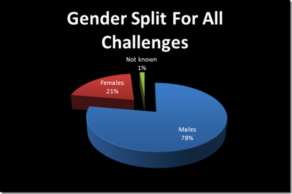
3) Keeping on the theme of gender, this one shows the gender split for all Challenges to date:
4) The average age of participant in each year is quite an interesting one too:
I’ve only known of the Challenge for a handful of years, and during that time I have always had the impression that the average participant is over 55. It seems, however, that hasn’t always been the case. In fact, the average age of participants has been increasing with the passage of years, although it’s not a year on year increase. The average age in 1980 was just under 36; it’s now just over 56.
5) Now we start getting a little bit more involved, using a form of graph that I didn’t even know existed in Excel! Here we have illustrated not just the average age of male participants, but also the spread of ages for that year. (I’m not quite sure what went awry with the numbers at the bottom in the copying and pasting, but they’re not important really.)
Just look at some of those upper ages!
And here’s the same information for the female participants:
Has anyone noticed yet how Mick has tried to be stereotypical in his colour choices for the gender-related graphs … except for the one where he transposed them, just to see whether I was paying attention.
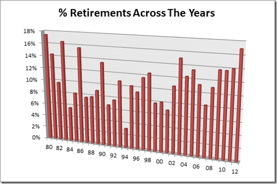
6) There is, in general, loads of information that we found to be interesting, but it was probably the retirements that caused us the most comments, so let’s just have a couple of illustrations of retirement data over the years, starting with the percentage of retirees each year:
I’m not sure what conclusions we can draw from that, except that 1994 must have seen particularly good backpacking conditions.
7) Finally (for now) here’s the information as to the percentage of retirees, by gender, across all of the Challenges to date…
… from which we have to conclude that you’re most likely to retire from the Challenge if you don’t know which gender you are!
Incidentally, this one doesn’t add up to 100% because it’s showing the percentage of that gender who retired (so, 9% of all female participants have retired, etc). As so many more men than women took part in the early years, and as most of the ‘unknown gender’ are from those early years, it’s likely that most of those unknowns are male. What this does seem to show quite markedly is that you’re more likely to retire during the event if you are male.
-----------------------------------------------------------------
So, there you go. If you didn’t feel thoroughly edified after November’s post on the subject, you surely must now?
There will no doubt be more graphs in due course. Mick’s got another project on the go for a while (yes, he has, once again, fallen back into employment), but he has plenty more ideas on this subject that he just has to put into graphical format.
Click to go to other Parts of this series of posts:


Wow.
ReplyDeleteI need a lie down in a darkened room.
I am in awe.
Wow.
Splendid, Mick, quite splendid.
ReplyDelete:-)
Sad.
ReplyDeleteps. Happy new year to you both.
Wow!
ReplyDeleteAt the start of Challenge 1994 there was very deep snow cover on the west coast mountains which may have pushed most Challengers on to low level routes, hence easy walking and a low number of retirements.
ReplyDeleteLooking at the rising age profile, I am interested to see what the age profile is for first timers over the years. Is that rising or remaining constant?
ReplyDeleteYou, Mr Sloman, are just putting ideas in the boy's head.
ReplyDeleteI bet you've got a whole list of suggestions to slowly drip feed him over the coming year...
;-)
I want to know why people retired.
ReplyDeleteCould you have it on my desk by 9:00am.?
Thanks.
You can go now.
Louise:
ReplyDelete:-0
Might have....
:-)
The sort of attention to detail i can admire but somehow not match, look forward to another year of reading your blog.
ReplyDeleteCheers J.P.
Fascinating stuff, very much appreciated. The most telling graph, to my eyes, is the average age and its risingness (is that a word?)…
ReplyDeleteTime he got a hobby - such as hill walking!
ReplyDelete